In 2020 and 2021, I worked with Artefice Group Milano to redesign Costa Crociere‘s logo, an iconic Italian company with over 160 years of history. The goal was to embrace a new brand direction marked by sustainable, responsible, and innovative choices through a modern and versatile visual identity.
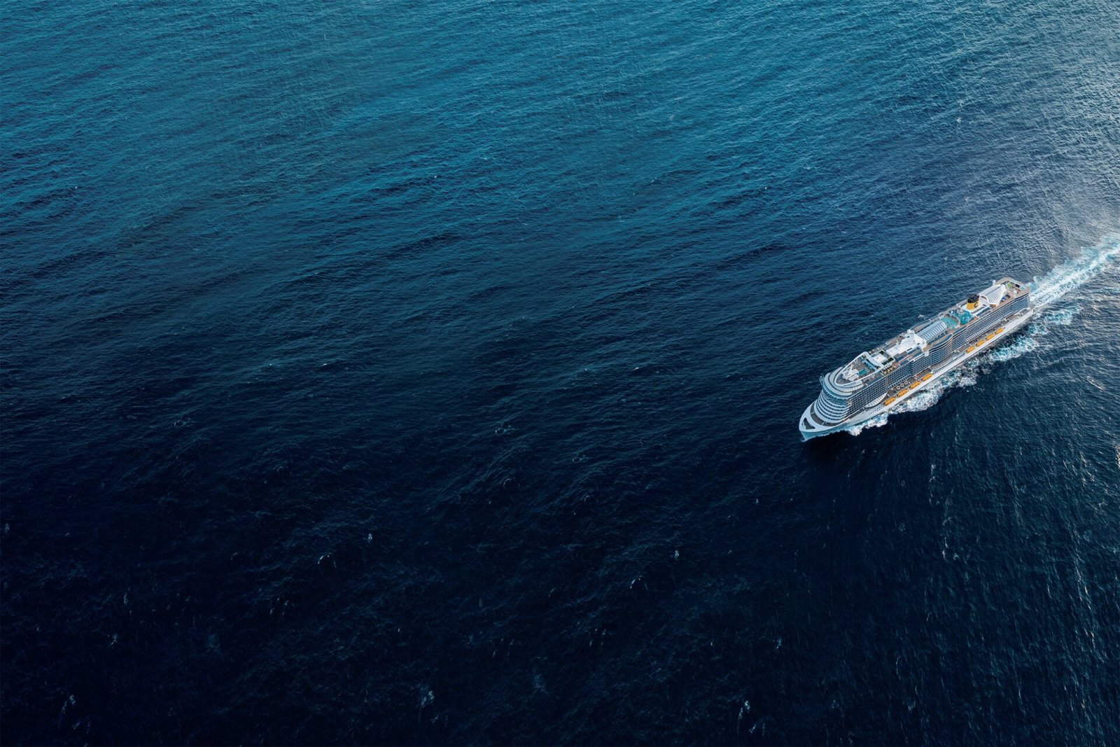
The logo became a crucial element in symbolizing this change, representing the shift towards zero-emission fleets and portraying cruises as transformative experiences. It aimed to connect not just tourist destinations but build strong connections among inclusive communities with unique experiences, values, and wonders to live.
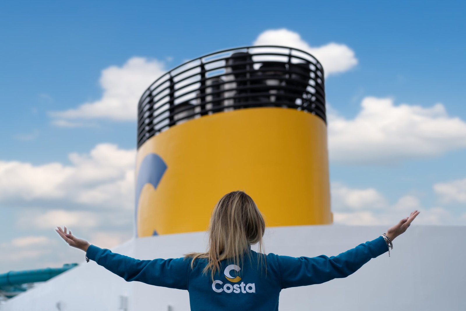
I played a key role in the project: i conceived and designed the logo icon in collaboration witht Artefice Group‘s creative and strategic teams. Addressing the graphic duality between the old logo and the iconic “C” on ship funnels, I transformed the “C” into a dynamic brandmark, symbolizing the embrace between land and sea. The blue and yellow color combination aimed to recall the iconic ship funnel while distancing it from its symbolic meaning in contrast to the company’s new direction.
The project had a big impact, termed a “revolution” and a “historic moment for cruise iconography” by La Stampa. It marked the first step in a comprehensive 360° repositioning, a “new chapter,” and a “historic moment for the world of cruises,” as Costa’s CEO, Mario Zanetti, said. A successful challenge, it led to increased onboard presence and broader social media engagement.
This journey wasn’t just a visual update; it was a strategic move and an exemplary model of sustainable rebranding in the cruise industry, reflecting a shared commitment to a new and responsible future.
Client: Costa Crociere
Where & when: Milano, 2020-2021
Credits: Artefice Group Milano
- Tag: Art direction, Concept, Logo Design


